0

Loading

Salem Tello Logo

hi@salemtello.studio

Case Study Real-estate lending / Since 2025

ROC360 Mobile App & Web Platform

One product on two surfaces. I designed the mobile app end to end and built the design system the web platform runs on. Then I built the thing underneath both: the context, the plugins and the React libraries an AI generates from, so what it hands back is made of real components instead of drawings.

Mobile App

Sole designer

Concept, UX and UI for all four roles. Engineering built and shipped it; every screen in it came from me. Live on the App Store and Google Play.

Web Platform

Design system owner, team of four

Tokens, components, documentation, theming and white label, plus the plugins and the AI pipeline that keep the whole thing on-system.

4.4/5 App rating, 478 reviews
136 Component sets, documented
7 Figma plugins built for it
2 React systems the AI builds from
5min Per on-system screen, six in half an hour
01 Overview

Concept design, a design system, and an AI screen generator

What I did

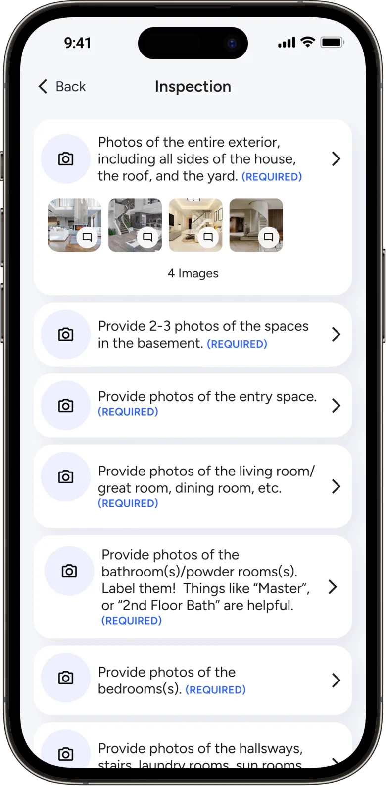
ROC is a real-estate loan-management product, and it carries four roles rather than one: borrowers, the lenders who approve and manage their loans, the salespeople who oversee both, and a point of contact invited to finish a single task. I was the sole designer of the mobile app, concept to final UI, across all four. On the web platform I own the design system the whole team builds on.

The part that is less usual is what sits under both. To design on-system without slowing down, I built the context an agent reads, the plugins that do the building, and two React libraries for it to build from. The first came out of the old platform's design, rebuilt along atomic design lines so an AI agent could generate screens in the style that was already shipping. The second is the Figma system in React, made for designers and AI alike: a design tool can install it and compose screens with real components. The production library is the piece still in progress.

02 The App

UX and UI, end to end

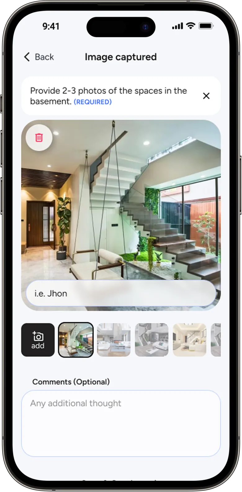
The only designer on it, from the first flow to the last screen, across all four roles. Engineering built and shipped it; every screen in it came from me.

The redesign

The starting point was ROC's existing web platform. I used it for content and context, then redesigned almost all of it: a modern UI, a smoother UX, and third-party features folded into one place instead of scattered across separate tools.

The business needed to move fast, so the app's system stayed lean on purpose. That's a real constraint in a real company. My job was to deliver at pace while keeping as much as possible standardized and consistent. The real design system comes later, and it comes out of what happened next.

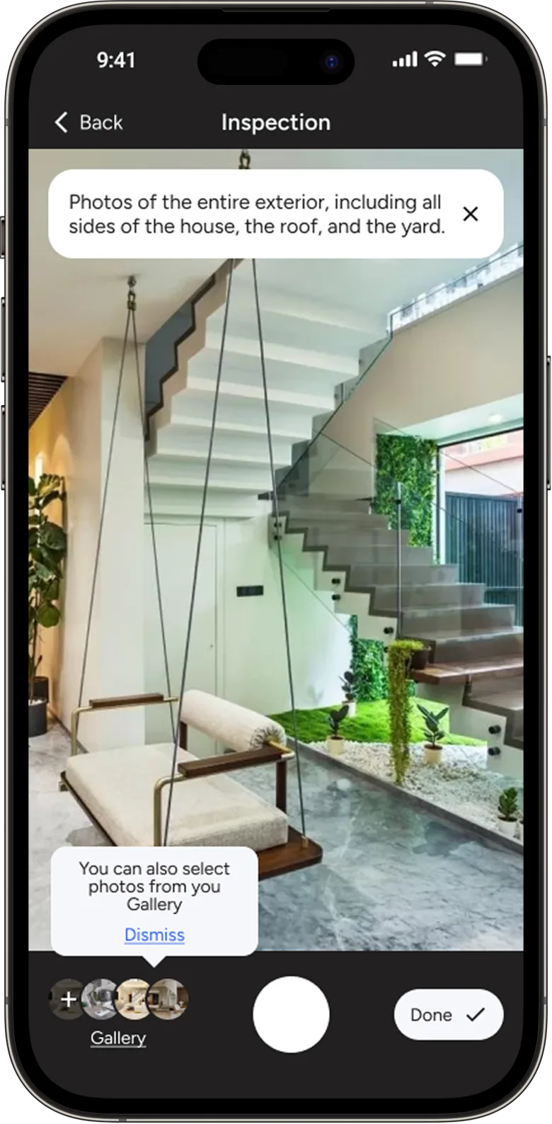
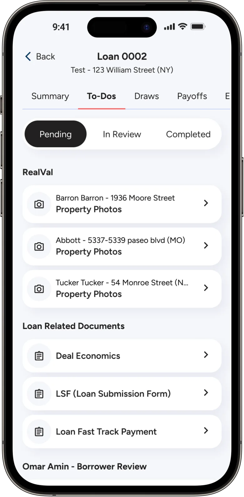
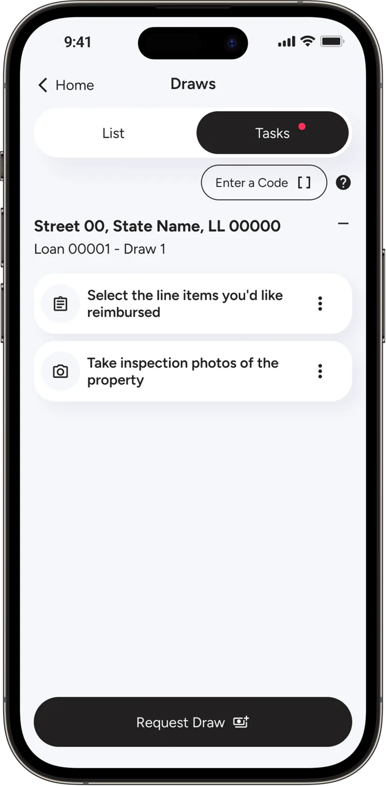
The mockup of the ROC app the platform was built from, its screens laid out side by side
Before · existing platform
  • Core actions scattered across separate third-party tools
  • Dense, dated UI that slowed everyday tasks
  • No mobile experience for any of the roles
  • Inconsistent patterns from organic growth
After · the redesign
  • Third-party features merged into one place
  • A modern, focused UI built for the task
  • A mobile-first app for all four roles, live on both stores
  • Consistent patterns from a shared system
What the users made of it

4.4 out of 5 across 478 reviews, and seven in ten of those are five stars. A rating covers the whole product, not the design on its own, and engineering is the reason it works. Every screen behind those reviews came from me.

03 The Web Platform

Same design concept in the web platform

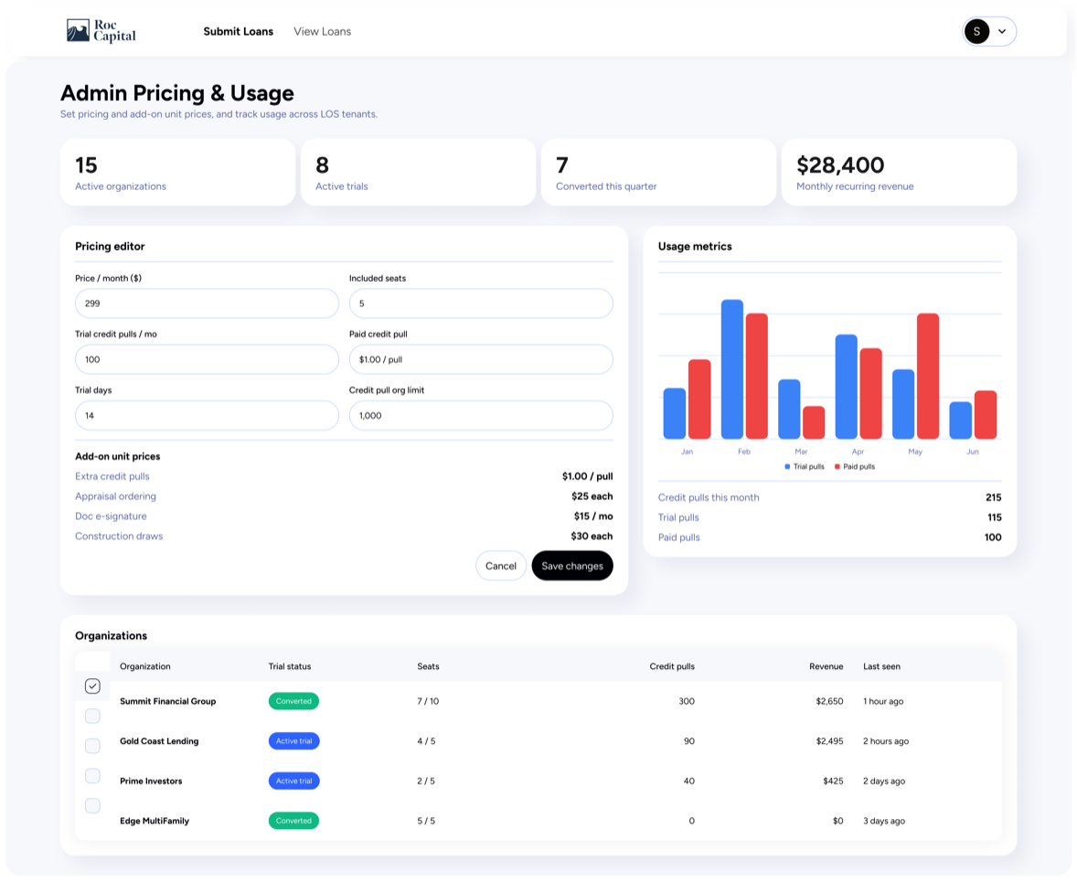
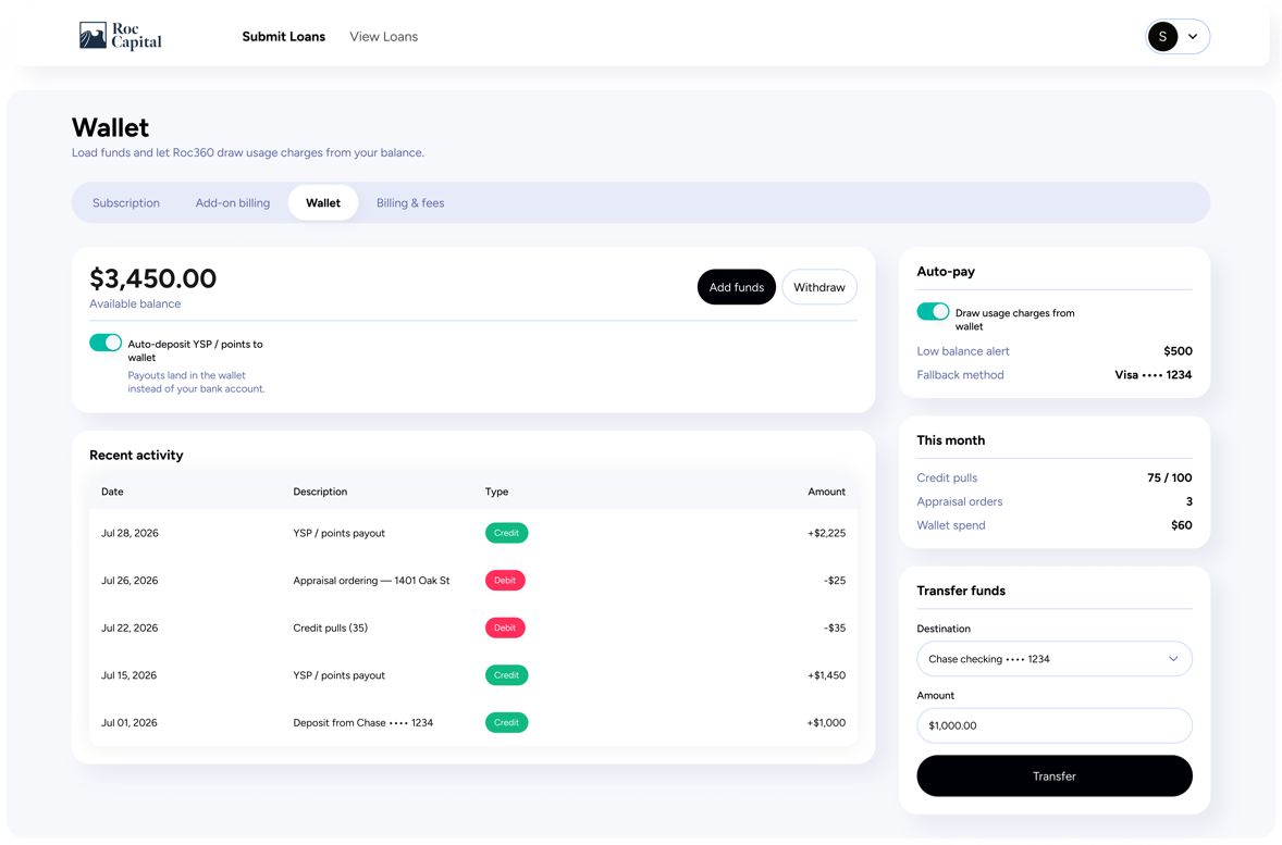
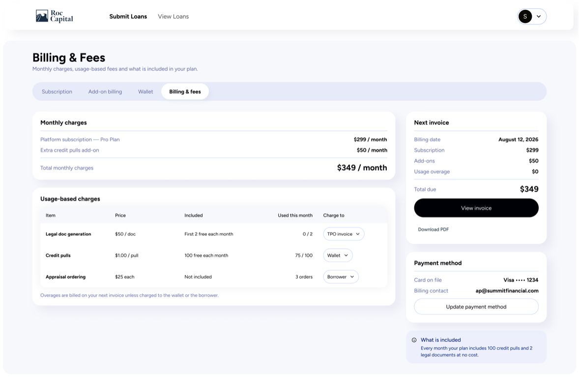
The platform came first as a product and second as a design. Once the app existed, its language was the one worth keeping, so the platform was redesigned from it rather than the other way round. That is the moment the two surfaces stopped resembling each other and started needing one source.

And then the system

Redesigning the platform screen by screen would have been a paint job. What the two surfaces actually needed was a shared source: the same tokens, the same components, the same rules about how a screen holds together. That is what the next chapter is.

04 Design System

Everything you need to keep building: Design, Developers, and AI

On the web platform I built the design system end to end: 136 component sets in the file, which is 52 finished components and the 84 molecules they are assembled from, across 2,017 variants and 407 tokens, every one of them documented. A v1 already existed, but it was shadcn out of the box and it fought the concept, so I rebuilt it instead of patching it. By hand first, then with agents once the rules were written down. Four of us design on it today, and it came full circle: I adapted the system back into the mobile app, so the two surfaces finally share one source instead of resembling each other.

Tokens, in three tiers

I started from shadcn as a base and reshaped its components to the concept. Most of the work went into the token layer: primitive → semantic → component, the shadcn way, but redistributed to fit how we actually build. Where the base library's tokens didn't fit, I created new ones using Tailwind's naming principle: some I didn't need, others didn't exist yet.

Atoms, molecules, screens

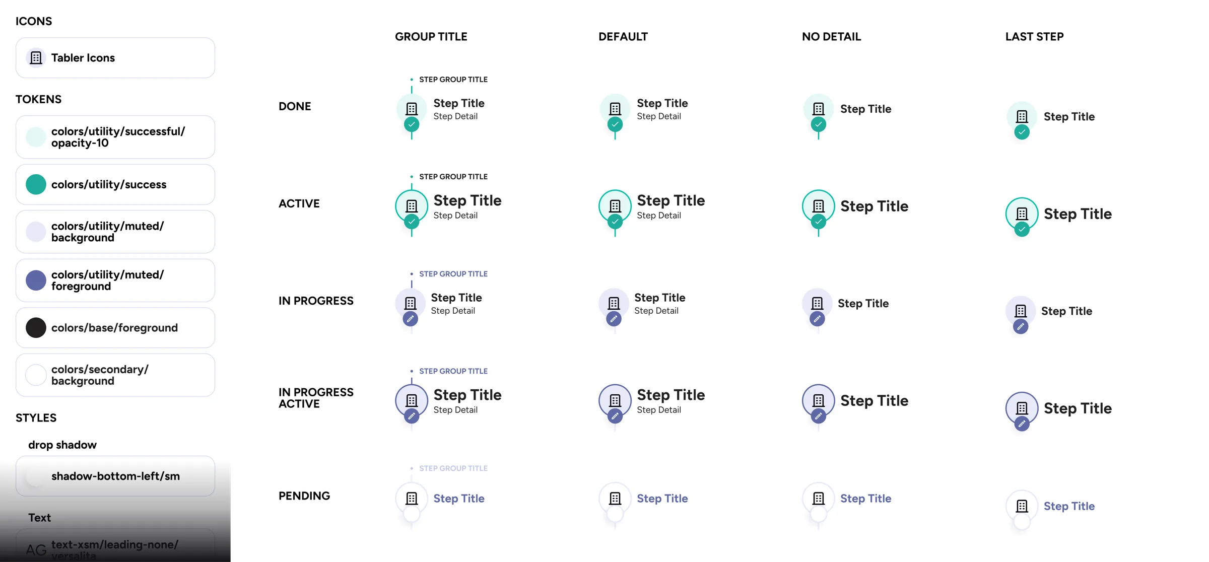
Built on atomic design, so a change stays contained instead of rippling across the whole library. That is also where the count comes from: of the 136 sets in the file, 52 are the components a designer places on a screen and 84 are the molecules those components are assembled from.

In a screen

The component doing its job

The same stepper inside the loan submission flow. The screen says which step it is on and the component already knows how to look.

The stepper inside a real screen: the loan submission flow, with completed steps, the current step and the ones still ahead

Documentation: AI/Designer component context

Every component carries a second layer of documentation, written for whoever picks it up: what it is for, when to reach for it, what it must never be used for, which variant answers which case, and the exact tokens it is allowed to touch. All 52 of them, the same shape every time. That a machine can read it too is the next chapter.

Component
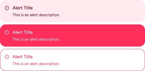
The Alert component from the ROC design system, in its neutral, solid and lined variants
Context

Alert

Kind
Alert
What it is
Contextual feedback banner for system events, validation results or status messages.
Variants
  • Alert neutral, with icon, title and description
  • Alert-solid filled background for high visibility: success, error, warning, info
  • Alert-lined left-border accent, lighter than solid
States
Static. No interactive states, purely presentational.
Properties
Icon (INSTANCE SWAP), Title (TEXT), Description (TEXT).
Compose with
Form validation, Dialog, page-level banners.
Do
Place it at the top of a view so it is the first thing users see.
Don't
Stack multiple alerts. Pick the most important one.
Properties, set every one, nothing at default

Alert / Alert-lined / Alert-solid

  • Variant [Default, Destructive] semantic tone: information or error
  • Icon leading status icon, swapped for a Tabler icon
  • Title Text / Description Text heading and body, per content
Call the components from the ROC design system with these Figma keys
  • Alert d84e9f38******
  • Alert-lined f348dbcb******
  • Alert-solid f7a6ae28******

Light, dark & white-label

The platform ships as a white-label product. Beyond light and dark, each brand gets its own theme: colors I define per brand, in OKLCH so lightness stays consistent no matter the hue. Semantic tokens do the work: swap the brand, and every component follows. Every component and every text-on-surface pair clears WCAG AA, in both modes and in every brand. Checked, not assumed.

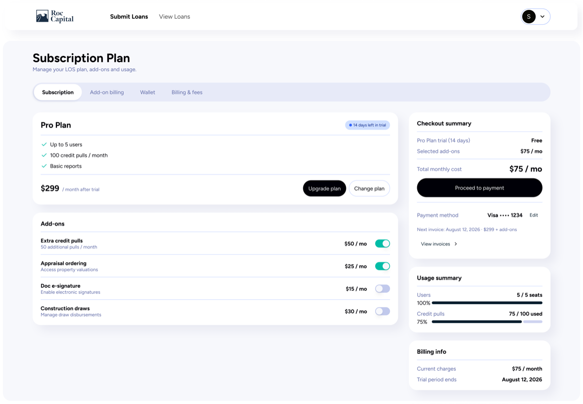
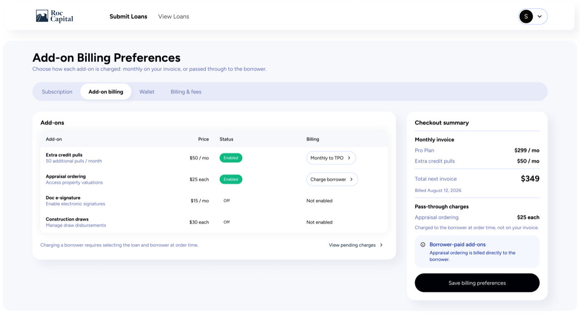
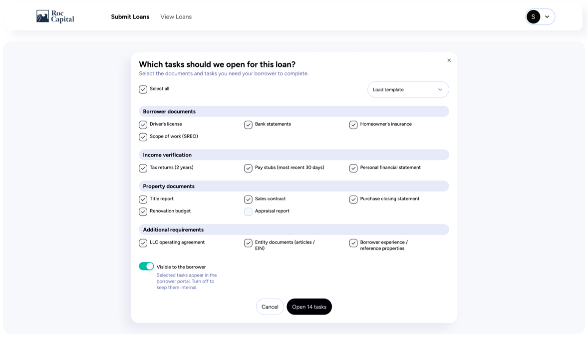
Sample of components built using HTML with an AI agent fed with the homemade Figma plugins, revised manually. Every text and surface pair clears WCAG AA in all thirty combinations. Checked, not assumed.

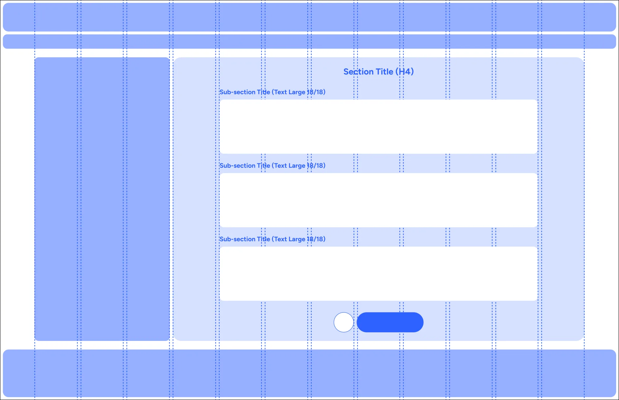
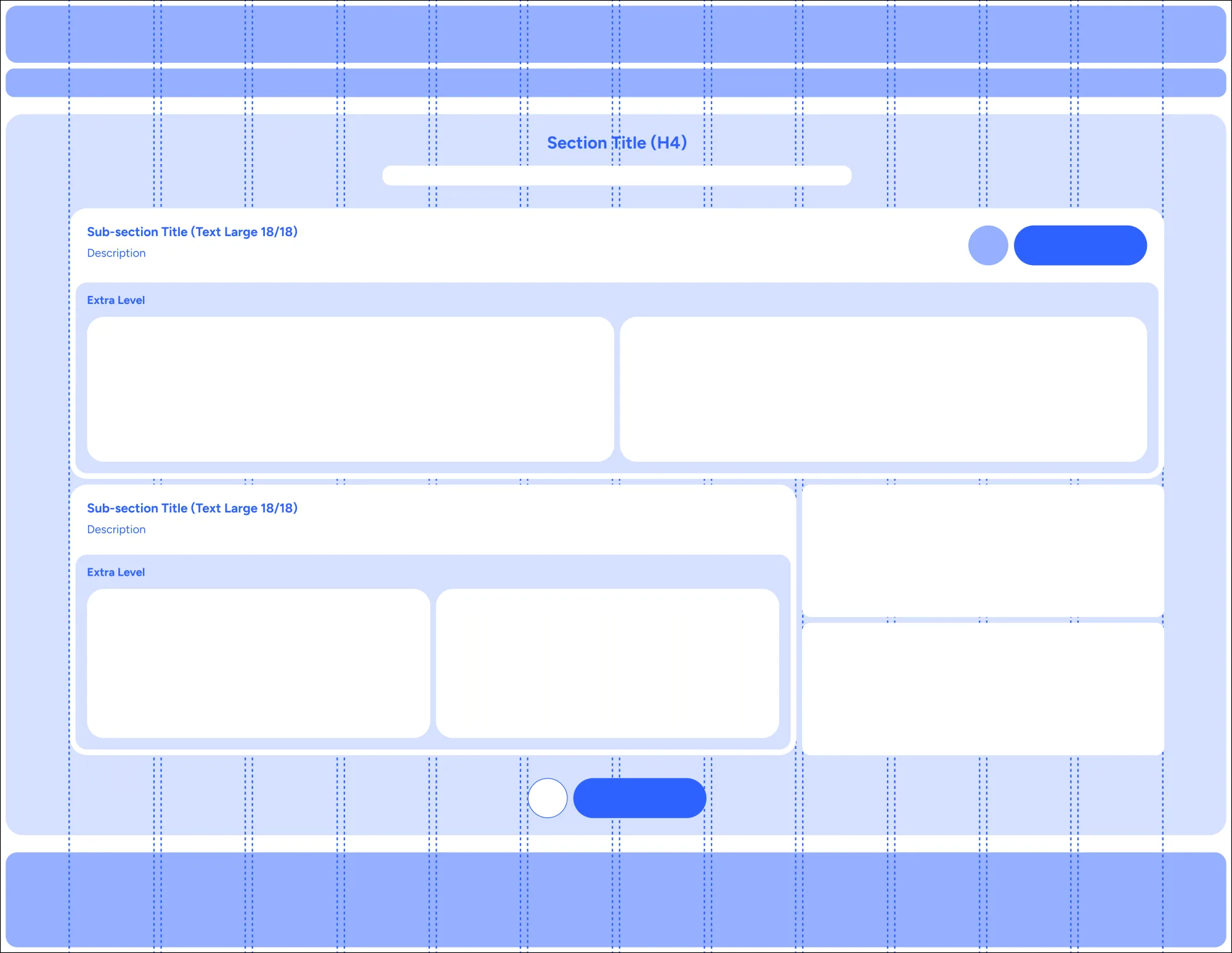
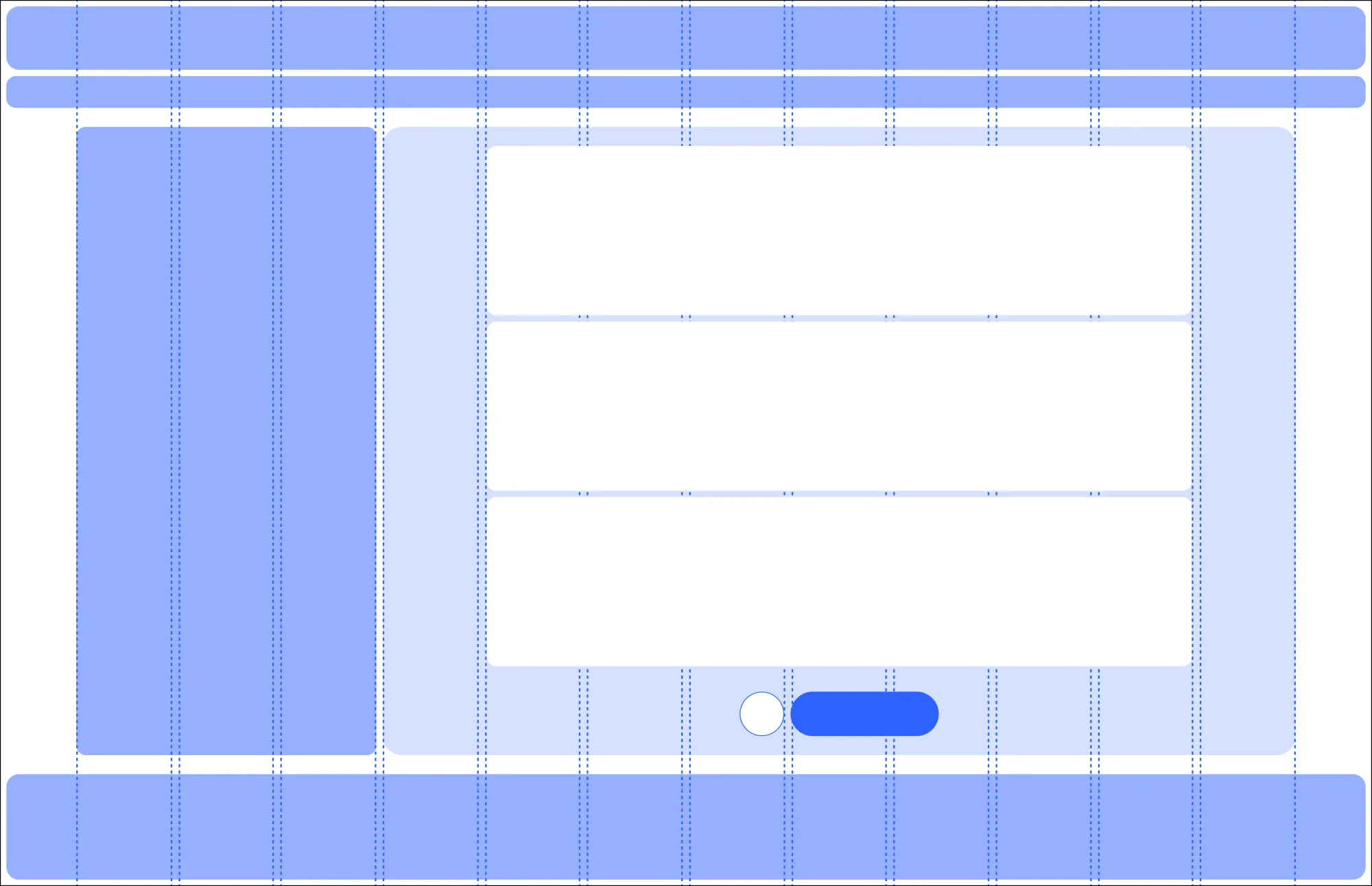
Layout is its own language

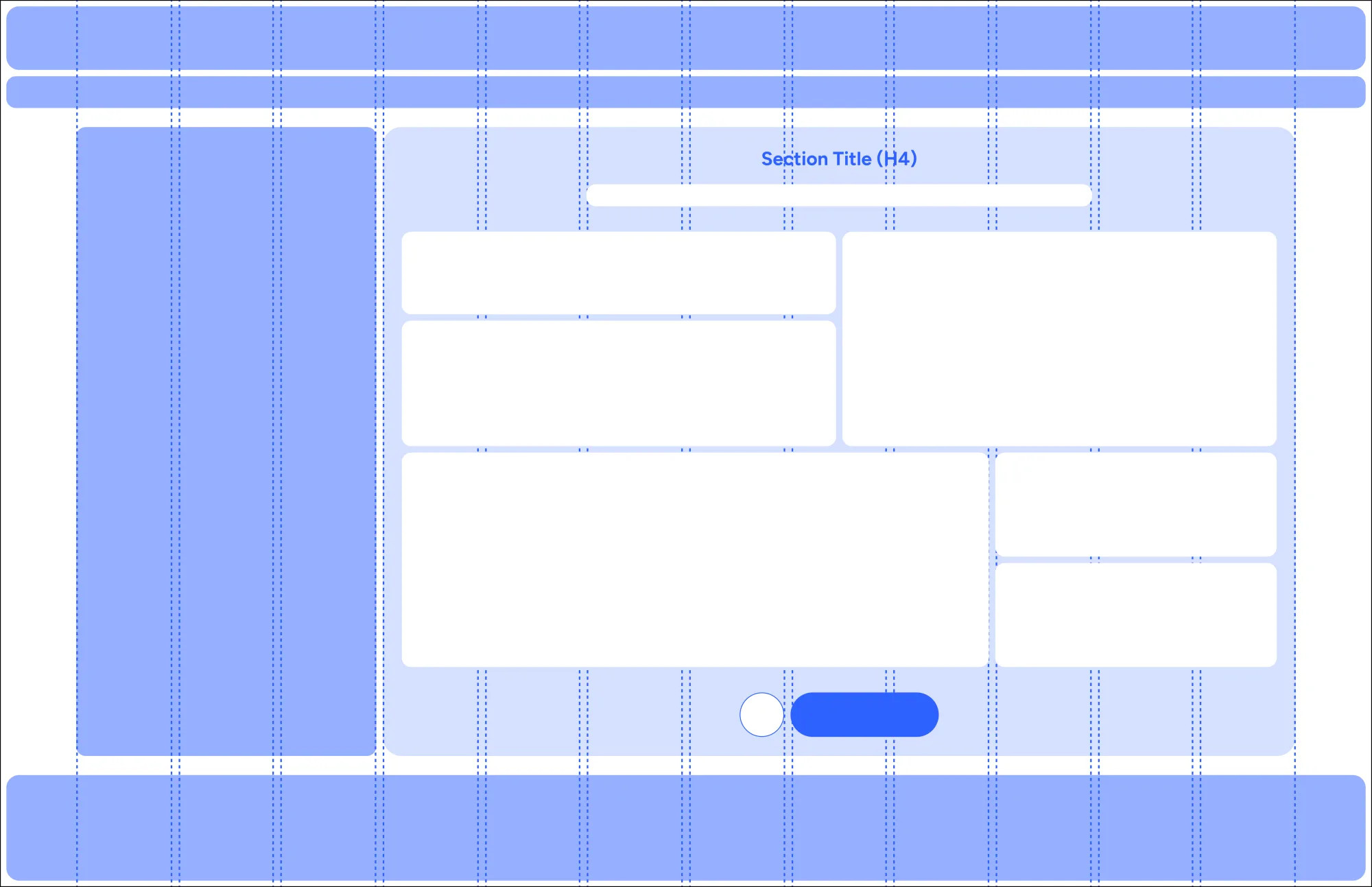
These are the layout pages. They are not decoration either: they are what an agent reads to decide where things go. Each one fixes a skeleton: margins, columns, how deep a card may nest, where the primary action sits, so the output lands on the grid instead of floating near it. Components told the agent what to use; these tell it how to arrange them.

Layout context: a card group on the grid, with the margins and columns drawn over it
Card group.
Layout context: a full-width bento card group with nested levels marked
Full width, bento.
Layout context: a sidebar with a single content column and its card group
Sidebar, single column.
Layout context: a sidebar with a single column and a bento arrangement inside
Sidebar, bento.

7 Figma Plugins

Seven plugins, all built for this project: Round-Trip Prover, Variable Extractor, Screen Builder, Auto-Fixer, Token Mapper, Layout Analyzer and Sync Engine. Building them is how I learned Figma from the inside: not the interface, the workshop behind it. Its node model, its typings, what a component really is once you strip the canvas away. That is what lets me change what an agent is made of instead of prompting it harder, and it is the half of this that nobody sells you. The agent decides, the plugins execute exactly, and I set what each one is allowed to see and touch.

05 The AI Agent

An AI builder fully bound to the Design System

Everything up to here is the design system. This is what it can do once a machine can read it. Give it a brief and a screen comes back in about five minutes: real component instances, real tokens, real styles, never a look-alike drawn from scratch. Six of them took half an hour end to end. The part nobody tells you is that it only knows what I put in front of it. The business, the constraints engineering has to live with, the reason a pattern exists in the first place: none of that is in the file, so all of it comes from me, and I review every screen before it moves. That is the normal shape of the deal. What I removed from the job is the mechanical half, and that half was most of the hours.

  1. The heart

    The Figma design system

    The whole library from the previous section, tokens in three tiers and every style bound. Everything downstream is a description of this.

  2. Extracted by

    The Figma plugins

    They pull the raw material out of the file: the tokens as JSON, the layout structure, the components and the screens, and the context of each component. Everything the agent will consume arrives already bound to the design system.

  3. Read by

    The AI agent

    It consumes all of the above, decides what a screen needs and which entry applies, and builds from it. It never invents a value, because the permitted ones are written down.

  4. Out

    On-system screens

    In the file, on the grid, bound to the library. Ready to be judged by a designer instead of rebuilt by one.

None of this works unless the system underneath it is properly built. Tokens in their three tiers, styles bound rather than typed, components made of tokens and styles, atoms and molecules that have names. The context file can only describe a system that is already coherent.

One entry per finished component, so there are 52 of them and not one per component set in the file. The molecules travel inside the entry of the component that uses them, along with its templates and its usage examples. The layout pages sit apart, because they document how a screen is assembled rather than what it is made of.

What the AI Agent Created

The whole thing rests on a contract I wrote at the top of the file: five rules, non-negotiable, and the first two carry the weight. Our system and our layout concept override any reference, so a screenshot is content only. And nothing gets built from scratch: every element is a component instance, with custom frames allowed only as structural wrappers that bind tokens.

The result

A screen now starts from a prompt against the system and its two guides, instead of from someone digging through the library to find the right instance. That is the part of the day this gave back to the team.

Designing with AI is a lot like building a site on WordPress. You can put something together fast, and nothing about it is guaranteed unless you already know what good looks like. What the system guarantees is that the screen is on-system. Whether it is the right screen is a different question, and it is still answered by a person.

Less AI, not more

The goal is not more AI, it is less. Every task that can be handed to a plugin gets handed to a plugin. Where this goes next is a model running locally: the work stays inside the tool and is never handed to anyone else, and a task that runs on a machine already on the desk is a task nobody burns a data centre on. Using less of it is the point, as long as less never means waiting. The tool works today. The balance is still being tuned.

And the code

Design that's ready to build

One plugin exports a component as JSON with every Figma typing, plus the tokens and styles as classes. I fed that to an agent along with the assets and it rebuilt the frames in markup: the structure and the tokens landed, the micro-interactions it invented. That layer is the next one to write into the context. I work in HTML, CSS and JavaScript, so the step into React is short, but real components out of this pipeline is a next step, not a claim I'll make yet.


The honest part

AI can build the screens. It still cannot work out what the client actually wants, and that part is still the job. Without the research behind it, and without the judgment to pick the right component out of the fifty that exist, this is a child building with Lego. It is a designer's tool.

Where it stands

The app is live on both stores. The system is in use by a team of four, on two surfaces that finally share one source. The builder works, and it works because someone had to build what it builds from. The production React library is the next piece.

Contact

hi@salemtello.studio

Under the General Data Protection Regulation (GDPR) (EU) 2016/679, we have a legal duty to protect any information we collect from you. Information contained in any email and any attachments may be privileged or confidential and intended for the exclusive use of the original recipient.

Next More projects

Website designed and developed by Salem Tello | All rights reserved 2026